Flutter: How to implement Cupertino UI (iOS Style), with examples!
In-depth explanation all about how to implement CupertinoUI (iOS) using Flutter on a real project! Get the project's code template and design for free

I'm Andre and I'm an ordinary computer science student and part-time freelancer from Indonesia 🇮🇩. I'm highly obsessed with mobile development using Flutter and Swift, some of the web development fields (React, Golang and NodeJS), while also being a UI/UX enthusiast. Surely I want to pursue other tech stacks while building fun and usable real projects along the way ⚡️.
Hello, folks of the developer community 👋!
I'm back with the promised article on Flutter 🔥, specifically in the Cupertino UI, or you may know it as the iOS-style implementation. For those who aren't familiar with Flutter, it's a framework by Google that provides an elegant UI Toolkit for multiplatform app development. Since its first release, Flutter has gained a lot of attention from the developer community. Thus, expanding its capabilities, in this context, various UI packages for developing a specific platform.
In my Flutter learning progress, I tend to build usable projects out of a specific topic I want to cover. This time, out of my fascination with Apple Design (Human Interface Guideline) and combined with my favorite music playlist channel on YouTube: Leeplay, I want to build a music player app with the native iOS looks.
Thankfully, the official Flutter team has provided the Cupertino package, which contains iOS-style widgets and behaviors. After I developed the music player app, I want to share my experience, references, and an in-depth explanation of each iOS widget used in the project. Moreover, you may refer to the official docs for more code examples and class properties.
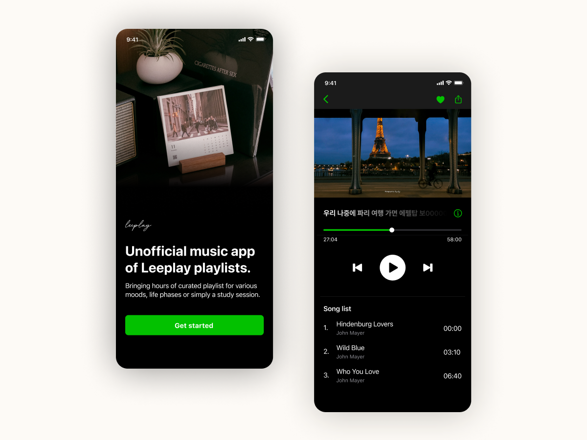 💡 Get the free UI Kit of Leeplay the music player app project here
Based on the HIG, I have designed the music player app called Leeplay. You might notice that I used a unique primary color to stand out from the original Apple apps like Apple Music, which used Apple's color palettes. As I promised in my first intro post, I will share the design asset and the design reference (in Figma) for the Leeplay project. Cheers 🍻!
Now, after the app's design intro, let's jump into the coding, and I will explain each widget I used along the way.
- Before initializing the project, I highly recommend using macOS for the development process where it has an iOS simulator and doesn't require any additional setup than Windows (Android). But again, our concern here is regarding the UI, thus allowing you to develop using Windows and its Android emulator.
- As usual, initialize the project using Flutter's command line itself.
- The first thing we're going to do is change the default
MaterialAppparent widget intoCupertinoApp. Essentially, this widget will render a global iOS behavior across the app. Moreover, we could define other global behaviors like routes, theme, app's title, disabling debug banner, and the usual home widget. - Let's continue working on the theming part. We will fill the theme property in
CupertinoAppwith theCupertinoThemeDataclass. Before getting into each property, I must highlight that the Cupertino package has provided many Cupertino-styled colors called theCupertinoColorsclass. As shown in the example below, the ThemeData class contains several theming properties such as:brightnessis for rendering light or dark based on provided themes.- The
primaryColoris pretty self-explanatory, where I used my accent color from the UI design asset. - The
scaffoldBackgroundColoris for the CupertinoScaffold widget's background color. textThemeproperty is for specifying a whole bunch of text use-cases across the app, typically based on some iOS components. In this case, we will useCupertinoTextThemeData, but I will only fill the default property. For the rest, I will create a static class with sets of properties with semantic naming and fill it with theTextStylewidget that follows the HIG. Using a custom static class like this is faster than calling the rootCupertinoThemevia the current context. 💡 Another bonus! I attached the customTextThemeclass code. Download it here!CupertinoApp( debugShowCheckedModeBanner: false, title: 'Leeplay', theme: CupertinoThemeData( brightness: (state is LightTheme) ? Brightness.light : Brightness.dark, primaryColor: const Color(0xFF00B903), scaffoldBackgroundColor: state is LightTheme ? CupertinoColors.white : CupertinoColors.darkBackgroundGray, textTheme: CupertinoTextThemeData( textStyle: TextStyle( fontFamily: "SFPro", color: state is LightTheme ? CupertinoColors.black : CupertinoColors.white, ), ), ), home: ..., )
Next on, we will continue slicing the UI pages. But, instead of elaborating on the process, I will only highlight the definition and implementation of every iOS-specific widget and package.
Scaffold.
Flutter provides several iOS-styled widgets to scaffold an entire page. The basic one is
CupertinoScaffoldPage, where we can modify its background color, child, and navigation bar. Just think of this one as the usualScaffoldwidget. If you want to implement the tabbed views, we can useCupertinoTabScaffold. This widget is robust because we can define our customBottomNavigationBarwidget and set up the logic of displaying pages or the scaffold's children according to the current context and active index.CupertinoTabScaffold( tabBar: CupertinoTabBar( items: const <BottomNavigationBarItem>[ BottomNavigationBarItem( icon: Icon(CupertinoIcons.music_note_2, size: 22), label: "Play" ), BottomNavigationBarItem( icon: Icon(CupertinoIcons.search, size: 24), label: "Search" ), BottomNavigationBarItem( icon: Icon(CupertinoIcons.square_stack, size: 22), label: "Library" ) ], ), tabBuilder: (BuildContext context, int index) { return CupertinoTabView( builder: (BuildContext context) { if(index == 0){ return const Homepage(); } else if (index == 1){ return const SearchPage(); } else if (index == 2){ return const SettingsPage(); } else { return const Homepage(); } }, ); }, );Routes and Navigator widget.
The routing and
Navigatorclass of Flutter is still working pretty much the same. But, iOS got a little behavior difference, where we can swipe right to go back. Regarding widgets, we got theCupertinoNavigationBar, where we can modify many properties. But here, I only modified the leading icon, removing the default title and expanding the trailing size to contain two icons.CupertinoNavigationBar( leading: CupertinoButton( minSize: 0, padding: EdgeInsets.zero, onPressed: () { Navigator.pop(context); }, child: const Icon(CupertinoIcons.back, size: 22), ), trailing: Row( mainAxisSize: MainAxisSize.min, children: [ Padding( padding: const EdgeInsets.only(right: 20.0, top: 2.0), child: CupertinoButton( minSize: 0, padding: EdgeInsets.zero, onPressed: () { Navigator.pop(context); }, child: const Icon(CupertinoIcons.heart, size: 24), ), ), CupertinoButton( minSize: 0, padding: EdgeInsets.zero, onPressed: () { Navigator.pop(context); }, child: const Icon(CupertinoIcons.share, size: 22), ), ], ), ),The other one is the
CupertinoTabBarwhich should be assigned only onCupertinoTabScaffoldas its bottom navbar. As usual, it's possible to modify any of its properties (height, background color, icon size, etc.), but by default, the widget already looks like the native iOS bottom navbar. In this project, I assigned severalBottomNavigationIconaccording to how manyCupertinoTabScaffold's children. Despite theBottomNavigationIconwidget being from the Flutter core widgets, it works pretty well here.CupertinoTabBar( items: const <BottomNavigationBarItem>[ BottomNavigationBarItem( icon: Icon(CupertinoIcons.music_note_2, size: 22), label: "Play" ), BottomNavigationBarItem( icon: Icon(CupertinoIcons.search, size: 24), label: "Search" ), BottomNavigationBarItem( icon: Icon(CupertinoIcons.square_stack, size: 22), label: "Library" ) ], ),Modal.
Cupertino design got several modals types:
ActionSheet,AlertDialog,ContextMenu, andBottomSheet. In Flutter, aside from theContextMenuwidget, we can use theshowCupertino...()methods to display these modal widgets. Then, we must assign the desired modal likeActionSheetin the method's builder. In this project, I only use theBottomSheetfrom the modal_bottom_sheet package. For some detailed examples of the official modal widgets, you may refer to these links.showCupertinoModalBottomSheet( context: context, builder: (context) => const AboutLeeplayBottomSheet() );Button.
The next widget is
CupertinoButton, which I used many times across the app. The button acts similarly to Material button, where you can provide pretty much all widgets as its child andVoidCallbackas itsonPressedmethod. By default, this button will have no background and a rectangular size (itsminSizeproperty). But, we can easily add background color via its property or a shortcut. Moreover, we can specify the button's padding,minSize(default wide), and the splash opacity (the iOS button will be fading in and out if tapped).CupertinoButton.filled( child: Center( child: Text( "Get started using NAVER", style: AppText.body.copyWith( fontWeight: FontWeight.w600, height: 1, color: CupertinoColors.white, ), ), ), pressedOpacity: 0.8, onPressed: () async { context.read<AuthCubit>().loginWithLine(); }, ),A little tip for me, if you want to mimic the Material's IconButton widget, we could modify the
minSizeproperty to 0, where theCupertinoButton's size will adapt to its child's size (the Icon widget).CupertinoButton( minSize: 0, padding: EdgeInsets.zero, onPressed: () { Navigator.pop(context); }, child: const Icon(CupertinoIcons.heart, size: 24), ),Text Field.
Flutter Cupertino provides two types of text field. The first one is the CupertinoSearchTextField widget which provides a native look to the iOS search bar. But to get it tidy and pretty symmetric, I must modify its padding value, icon size, and icon spacing value a bit.
CupertinoSearchTextField(
   onChanged: ((value) {}),
   placeholder: "Search Leeplay's playlists from YouTube",
   padding: const EdgeInsets.all(12).copyWith(top: 10),
   prefixInsets: const EdgeInsetsDirectional.only(start: 12),
   suffixInsets: const EdgeInsetsDirectional.only(end: 12),
)
The second one is the default CupertinoTextField, which sadly I didn't use in this music app. Still, it behaves similarly to the default TextField, where can specify its style, padding, and even disable the suggestion feature on the iOS keyboard. For more info on CupertinoTextField class, you may refer to it here.
Loading Indicator.
Another widget in this project is the iOS loading indicator or
CupertinoActivityIndicatorin Flutter widgets. By default, this widget will render a grayish loading indicator, where we can modify its color and radius (circular size).const CupertinoActivityIndicator( radius: 16.0, ),Settings UI.
For the settings page, I used a pub.dev package called flutter_cupertino_settings. This package is useful if you want to render an iOS-styled settings UI, where it provides several widgets like
CSHeader,CSControl(slider), andCSSelection(dropdown), andCSSwitch(switch) to speed up the development. To get started, wrap your entire setting widgets under theCupertinoSettings(). Under the hood, these custom widgets still use some basic widgets likeSliderandSwitch, which you can read the docs here. Unfortunately, some of its styles are inconsistent, but they can be resolved manually. Still worth the time!
Finally, I've summarized all of the iOS / Cupertino widgets and packages that I've used across this project. There are indeed some other Cupertino widgets I haven't used in the Leeplay project, but I recommend you dive into the Flutter official docs on those widgets. As the final step of development, I will release this iOS-styled app. Whether you want to release it for the iOS platform or even force it to the Andoird platform, the production build process is the same and simple as explained in the Flutter docs here.
In retrospect, I'm confident that Flutter is robust enough to build an iOS app with its native looks 🔥. But, honestly, with my little background in SwiftUI development, I think Flutter is still outclassed by the native development tool. Fortunately, the development experience using Flutter is quite exceptional. I appreciate that Flutter still carries its big value of multiplatform where their core widgets are perfectly usable and basically can render anything.
Thanks for reading folks, I'm open to any of your feedback and I do hope that the UI design file and the code template could be useful for you guys!
Cheers, Andre 👋.

